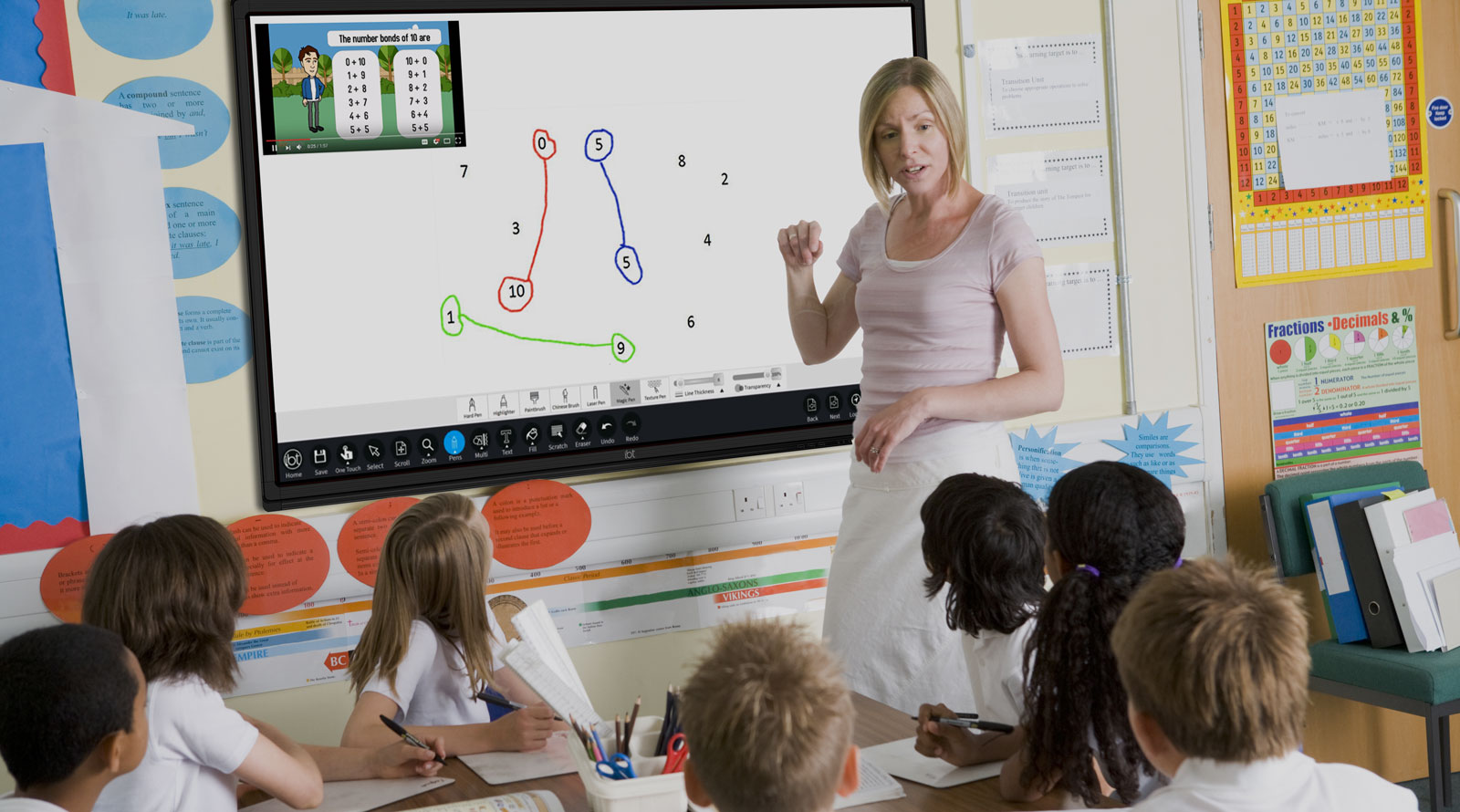
A new 5th class will walk into this room next September. We are going to design a welcome poster for them.
Think about two posters: one that feels balanced and settled, and one that feels a bit off. What is different about the way the shapes are arranged?
Here is the first idea designers use: measuring how much of the page a shape covers.
On screen is a title box that is 6 cm by 5 cm, shown on a 100-square page. How many squares does that box cover? What share of the page is that?
The second idea is rotational symmetry.
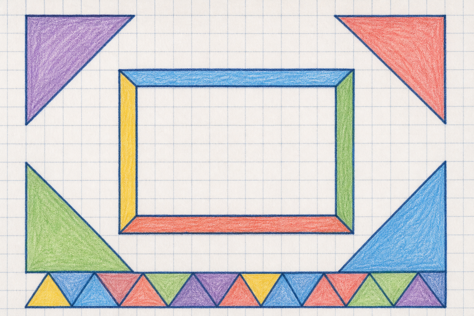
Watch as the same corner shape is drawn into each of the four corners of a poster plan, each copy turned a quarter turn around the centre. Count how many times the plan looks the same in one full turn.
The third idea is a tessellating border: copies of a shape fitting edge to edge with no gaps and no overlaps.
Let's work this out together on the board. Our poster page is a 10 by 10 grid, so the whole page is 100 squares.
Now we design the corners of our poster together. Tap a square near one corner: the board copies it into every corner, turned and flipped, so the whole design keeps its order-4 symmetry. Take turns to add a square at a time.
When the corners look good, count the shaded squares. How many of our 100 squares do they cover? What percentage of the page is that?
The third idea is the border. A border tessellates when copies of one shape fit edge to edge with no gaps and no overlaps. Which of these three shapes could make our border?
Then: a border one square wide all the way round our 10 by 10 page. How many of the 100 squares does it cover? What percentage of the page is that?
You're previewing this lesson. Get full access to this lesson and hundreds more — each one ready to teach, with interactive activities, printable resources and pupil progress tracking built in.